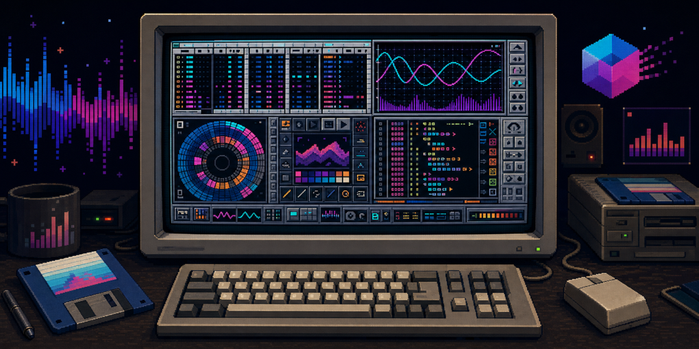
Demoscene Interfaces: When Creative Tools Had a Point of View
Modern software tries hard to disappear. Buttons retreat into menus, platforms publish design systems, and unrelated applications converge on the same rounded panels and restrained colors. The result is usually easier to approach, but it can also feel as if every tool was designed by the same committee.
Demoscene software came from a different world.
During the 1980s and 1990s, small groups of programmers, musicians, and artists built real-time audiovisual demonstrations for machines such as the Commodore 64, Amiga, Atari ST, and MS-DOS PC. They competed to produce the most impressive result within hard limits: a slow processor, little memory, a floppy disk, or sometimes an executable measured in kilobytes.
The scene did not only produce the finished demos. It produced an entire workshop around them: assemblers, lookup-table generators, music trackers, data extractors, executable compressors, disk copiers, font editors, and tools for recovering source code after a crash. Those applications were often dense, inconsistent, and proudly theatrical. They also fit their users unusually well.
This is what creative software looks like when the people making the work also make the tools.
The Interface Was Part of the Performance
The demoscene grew from the crack intros that software groups attached to copied games. What began as a signature became a competition in animation, music, typography, and programming. Eventually, standalone demos became the main event.
That history shaped the tools. A utility did not have to look like neutral office software. It could advertise the identity of its author or group. Gradients, metallic panels, custom fonts, animated raster bars, sound effects, jokes, and hidden games all belonged in serious production software.
There were practical reasons for custom interfaces too. Many programs took over the display rather than using the operating system’s normal desktop. Screen resolutions were low, memory was scarce, and standard widgets did not always suit work that involved editing samples, inspecting memory, or arranging events one video frame at a time. The fastest route was often to draw exactly the controls the program needed.
The result was not random decoration placed on top of conventional software. Form, identity, and workflow grew together. Even when an interface was awkward for a newcomer, it could become extremely fast for the small community that used it daily.
Precalculation: Moving Expensive Work Out of the Demo
A demo is generated in real time, but that does not mean every value is calculated from scratch while it runs. On a machine with a 7 MHz processor, repeated trigonometry can consume time better spent drawing pixels or playing music.
The standard escape hatch was precalculation. A creator generated a table of values ahead of time, stored it with the program, and looked up the answers during the demo. A sine table could drive a bouncing logo, a scrolling path, a rotating object, or the position of a sprite without evaluating the function every frame.
That need created a wonderfully specific category of tool. Elite Sinus Producer, released for the Amiga by Ipec Elite in 1988, generated paths and tables for later use in assembly code. Its opening menu paired function-key navigation with a loud cuckoo-clock sample. One option produced a flower-like curve. Its help screen placed instructions over flashing colors and moving raster bars, treating documentation as another opportunity for an effect.
The Sinus Creator solved a similar problem with a mostly textual, two-window interface and exported results in a form suited to the Seka assembler. Neither tool tried to become a general mathematics package. Each existed to remove one recurring inconvenience from demo production.
This pattern is worth remembering. A tiny utility can have enormous leverage when it turns expensive runtime work into cheap data and emits exactly the format consumed by the next stage.
Assemblers That Were Also Machine Monitors
Most ambitious Amiga demos were written close to the hardware. The popular assemblers therefore did more than translate source code into machine instructions.
Seka and its many descendants combined an editor, assembler, debugger, and machine monitor. On startup, Seka asked how much working memory it should reserve. From its command mode, a programmer could inspect memory, examine CPU registers, load source, assemble it, and jump into an editor. The interface reflected the actual task: direct conversation with a computer whose state was always close at hand.
Asm-One expanded the same basic idea with more commands and its own dedicated screen. It was part of a sprawling family of Seka-derived tools, including unofficial modifications with names such as Trash’m-One. The variations were not merely competing products. They show a community adapting its shared workshop through copying, extension, and personal preference.
This environment also explains why scene programming was so crash-prone. Code that manipulated hardware directly could take down the whole machine, and the Amiga did not isolate every program behind modern memory protection. One incorrect address might end the session before the latest source had been saved.
The scene answered with another focused utility: Save Our Sources. After a warm reboot, it searched memory for Seka source that might have survived the crash. Recovery was not guaranteed, but unchanged RAM could contain enough of the editor’s buffer to rescue hours of work.
The workflow formed a tight loop:
- Edit and assemble code.
- Run it directly against the hardware.
- Crash the computer.
- Reboot without clearing memory.
- Recover the source and continue.
The recovery tool was not a substitute for saving. It was a recognition that failures were normal in experimental systems work, so the environment should make failure less expensive.
Rippers Turned Memory Into a Shared Material
Demos were built in a culture of inspection and reuse. If a game contained a compelling tune, sprite, font, or sample, a creator might want to study it or use the raw material elsewhere.
Rippers searched memory for recognizable data formats left behind after another program ran. Multi-Ripper represented the category well: it could scan for several kinds of music and graphics rather than requiring the user to know an exact address. Similar tools proliferated because the machines had little isolation and their media formats often had recognizable headers or layouts.
The word “ripper” sounds hostile in a modern software supply chain, but the tool also reveals how people learned. Executables and memory were open specimens. A young programmer could encounter an effect, inspect its ingredients, extract data, compare formats, and build something new. The boundary between user and developer was thin.
That openness existed alongside piracy and loose attitudes toward ownership, so it should not be romanticized without qualification. Yet the technical lesson remains useful: inspectable artifacts create a path from admiration to understanding. When every file is encrypted, signed, remotely streamed, or hidden behind a service, experimentation becomes safer for vendors and harder for the curious.
Trackers Made Music Look Like Code
Music trackers are the most influential demoscene tools because their central interface survived the era that created it.
Instead of arranging clips on a horizontal timeline or writing notes on a staff, a tracker presents vertical columns. Time moves down the screen. Each row can hold a note, an instrument number, volume, and compact effect commands. Several columns represent the available sound channels.
To a programmer, the resemblance to code or a spreadsheet is immediate. A composition is precise, repeatable data. Notes can be copied as blocks, effects can be entered as commands, and the musician can reason about the exact point at which an event occurs.
The lineage began before the name “tracker” became standard. Chris Huelsbeck’s SoundMonitor on the Commodore 64 displayed one track for each sound channel and influenced Karsten Obarski’s Ultimate Soundtracker for the Amiga in 1987. Soundtracker was commercial software, but descendants quickly spread through the scene.
NoiseTracker, made by the Swedish duo Mahoney and Kaktus, helped establish the pattern. ProTracker extended it and became a foundation for countless modules, variants, and compatible players. Its screen packed the pattern editor, instruments, song positions, transport controls, and status information into a small area.
The density came with traps. ProTracker’s disk operation screen, for example, put a tall exit control between the arrows used to scroll the file list. Someone trained on normal Amiga applications could understand almost everything and still make the wrong click.
That near-familiarity is more revealing than a completely alien interface. The tracker borrowed common controls only when useful and ignored platform conventions when its authors preferred another arrangement. It was optimized around a practiced user, not a first-run tutorial.
Other platforms copied and mutated the idea:
- Digicomposer on the Atari ST followed the NoiseTracker pattern closely.
- FastTracker II on MS-DOS supported advanced PC audio hardware, 16-bit samples, and far more channels than early Amiga trackers. It also hid a playable Snake game inside a professional music tool.
- Abyss’ Highest Experience brought a Commodore 64-like chiptune sound to the Amiga while mixing the tracker layout with the cleaner visual style of later Workbench software.
- JamCrackerPro rejected the usual single custom panel and used multiple system-friendly windows.
- Megatizer for the Atari ST demonstrated that visual identity could be a sufficient design goal even when the program’s history is poorly documented.
The tracker layout endured because it maps well to a certain way of thinking. It is poor at making the first empty loop feel effortless, but excellent at exposing structure. Every event has an address. Repetition is visible. Fine edits are deterministic. A musician who does not play parts live can construct them with the same confidence that a programmer edits a table.
Modern trackers such as Renoise and hardware such as Polyend’s Tracker continue that workflow. The interface did not survive merely as nostalgia; it represents a valid model of composition.
Disk Copiers Visualized the Physical Medium
Before demos could be downloaded, they traveled on floppy disks. A normal operating-system copy was not always enough because some productions bypassed the filesystem and stored data directly on disk tracks.
Specialized disk copiers made that physical organization visible.
X-Copy displayed a grid with a cell for each track. During a copy, cells changed to report progress and errors. When the process finished, the Amiga played a distinctive “boing.” It was direct status reporting: the picture on screen corresponded to the surface being read and written.
X-Copy was a commercial product created by people with scene connections, then copied widely inside the scene itself. It appeared in many versions, including modified releases distributed by cracking groups. D-Copy was a non-commercial alternative with an interface whose appeal was partly aesthetic. Users chose it because it worked and because it looked cool.
These applications show the benefit of representing a task in the shape of its data. A generic progress bar says that work is 63 percent complete. A track grid says which part of the disk succeeded, where the drive struggled, and how much physical territory remains. The second display is more specialized and more informative.
TrackmoDOS took this principle further. A “trackmo” stored its assets directly on floppy tracks, so tools were needed to build and manage that layout. TrackmoDOS provided a suite for writing and deleting files in a track-based production, wrapped in a colorful custom file manager. The author was not merely styling an existing filesystem browser. The unusual storage model required its own view.
Compression Was Part of the Creative Pipeline
Space limits made executable compression another essential trade.
Tools such as Titanics Cruncher compressed a finished program to save disk space. The compressed executable carried a small decompressor that restored it when launched. Loading took longer, but the distribution became smaller.
This was a favorable asymmetry: compression could be slow during production, while decompression needed to be fast enough for the audience. The same idea underlies later packers and size-coding workflows. When an intro must fit into 64 KB or 4 KB, compression is not a deployment detail. It affects architecture, assets, and the range of effects that can be included.
Like trackers and assemblers, crunchers multiplied into many incompatible varieties. That proliferation created yet more utilities: decrunchers, format detectors, and rippers designed for particular packers. A tool solved one constraint and simultaneously created a new layer of ecosystem knowledge.
Editors for the Scene’s Native Media
The workshop extended beyond code and music.
ANSI editors created the colored text graphics used on bulletin board systems. Digital Intelligence’s ANSI Editor for the Amiga had a toolbar that displayed the active colors without allowing the user to select them there; color selection lived in a pull-down menu instead. The display looked actionable but was not, an excellent example of character winning over obvious behavior.
Character editors served an even older form of scene communication. Scrolltexts carried greetings, credits, jokes, arguments, and technical notes through demos and crack intros. A custom font made the message distinctive, so tools such as Charedit on MS-DOS let artists edit the underlying character set.
Special hardware produced special editors. The Atari Falcon included a Motorola 56001 digital signal processor, and DSPdit provided an editor and assembler for DSP56k code. Unlike the flamboyant full-screen utilities, it used the Atari GEM toolkit and looked comparatively professional. Scene software was not bound to one aesthetic; it used the system desktop when the desktop served the job.
Pixel artists often relied on mainstream tools. Deluxe Paint was so dominant on the Amiga and PC that there was little pressure for the Amiga scene to replace it. The Atari Falcon did have scene-made painters, including the memorably named FuckPaint. The contrast is instructive: communities build replacements where existing tools fail them, not as a ritual.
Security Tools Inherited the Same Theater
The Amiga’s first widespread virus attacked floppy boot blocks. That was especially dangerous in a culture where disks circulated constantly and custom boot sectors could contain loaders or other important code.
The Swiss Cracking Association created the SCA virus, which spread widely. Members of the same group later released a virus remover to counter it. The resulting utility did not adopt the sober appearance now associated with security software. It announced itself with the same oversized lettering and scene bravado as other tools.
This is another reminder that “professional-looking” is a cultural convention, not a functional property. A virus scanner can be effective without a shield icon, a white dashboard, or a reassuring enterprise-blue palette. The real questions are whether it detects the threat, makes the affected media clear, and lets the user act safely.
Disk Magazines Made Reading Interactive
Scene publications arrived as executable disk magazines. They combined articles, music, graphics, and a custom reading interface into one release.
RAW, a popular Amiga diskmag in the early 1990s, used glossy textures and a built-in palette editor that let readers change text colors. Other magazines turned article selection into small games or animations. Reading was not separated from the identity of the publication; the shell was part of the editorial voice.
A web article today is expected to remain accessible, searchable, linkable, and comfortable across devices. Those are genuine improvements. But the diskmag demonstrates what was lost when publishing containers became standardized. A magazine could once decide that navigation, typography, sound, and interaction all belonged to the issue.
What These Interfaces Got Right
It would be easy to reduce demoscene UI to nostalgia: gradients, pixel fonts, loud samples, tiny screens, and controls that punish the uninitiated. That misses the deeper value.
The best of these applications shared several qualities.
They modeled the work directly
Disk tracks appeared as tracks. Music appeared as timed events and commands. Memory inspection remained close to editing and assembly. A sine-table generator exported source in the format its assembler expected.
They were built by active users
Toolmakers experienced the same slow steps, crashes, and repetitive conversions as everyone else. Their applications grew from concrete friction rather than an abstract feature matrix.
They respected experts
Dense screens and keyboard-driven commands imposed an initial cost, but they also kept the full working state visible. Features did not disappear behind several layers merely to make the first minute look calm.
They allowed personality
The cuckoo sample, metallic panel, custom font, or hidden Snake game did not improve task completion in a benchmark. They made the tool memorable and strengthened the connection between a program and its community.
They formed pipelines
The output of one utility became the input of another: generate a table, include it as assembly source, assemble the demo, compress the executable, write it to tracks, and copy the disk. Good creative tooling is less about one perfect application than low-friction movement between specialized ones.
What Modern Toolmakers Should Not Copy
Personality is not permission to ignore usability.
Text over flashing red and cyan backgrounds is difficult to read. A button that appears selectable but is only a status display creates needless confusion. An exit control placed between scroll arrows turns routine navigation into a risk. Interfaces designed only for their authors can exclude everyone else.
Modern software also serves broader audiences and must account for accessibility, localization, touch input, multiple screen sizes, security boundaries, and reliable data recovery. The old tools often assumed one display mode, one input device, one language, and a user willing to learn by experimentation.
The useful lesson is not “make every application weird.” It is to standardize deliberately. Keep familiar controls where familiarity reduces errors. Break convention when the work has a shape that conventional controls cannot express. Give experts a dense path without forcing beginners to understand the entire machine on day one.
Most importantly, let a tool reveal who it is for.
Software Can Be an Instrument
A tracker is closer to a musical instrument than a generic application. An assembler-monitor becomes part of a programmer’s physical rhythm. A track grid teaches the shape of a disk while it copies one. These interfaces reward practice because they expose their internal model instead of flattening every task into forms and modal dialogs.
That is the enduring achievement of the demoscene workshop. Its tools were made under severe constraints, passed informally between small groups, and frequently ignored the rules of commercial interface design. Some choices were brilliant, others baffling, and almost none were anonymous.
Software does not have to choose between usefulness and character. The scene proved that an interface can be a production tool, a learning environment, and a piece of culture at the same time.
Sources
- Carl Svensson’s catalog of demoscene user interfaces
- Hacker News discussion
- Demozoo’s community archive and FAQ
- Elite Sinus Producer and Ipec Elite archive entry
- Titanics and Titanics Cruncher archive entry
- The history of music trackers
- Assembly’s introduction to demoscene history
- Markku Reunanen’s research on demoscene tools and platforms