Your Website Is Not for You: A User-Centered Design Playbook
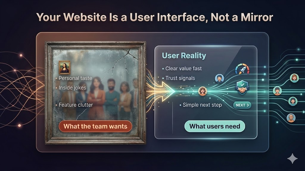
The core message sounds obvious, but most teams still miss it: your website is not a personal expression surface. It is a decision support system for strangers who do not know you yet.
If visitors cannot answer three questions in seconds, you lose them:
- What is this?
- Is it relevant to me?
- What should I do next?
Everything else is secondary.
Why Teams Build for Themselves by Default
The most common website failure is not bad engineering. It is internal perspective lock.
Founders, designers, and engineers are too close to the product. They know the roadmap, they know the tradeoffs, they know the acronyms. So they unconsciously design pages that reward insider knowledge.
That creates a gap between internal confidence and external comprehension.
Inside the company, a headline can feel elegant and clever. Outside the company, the same headline can feel vague and risky.
The user does not care about the story in your head. They care about reducing uncertainty in their own head.
The First-10-Second Rule
Most homepage performance problems happen before content depth matters.
People scan first, commit later. In practice, your opening viewport is doing most of the heavy lifting:
- Value proposition clarity
- Trust posture
- Navigation confidence
- Action path
If these fail, users do not scroll far enough to appreciate your “real” content.
This is why teams with beautiful long-form pages still underperform. The issue is often not quality of writing. The issue is late delivery of meaning.
A Better Mental Model: Website as an Operational Funnel
Treat your site as an operating pipeline instead of a brand artifact.
Stage 1 is attention. Stage 2 is orientation. Stage 3 is confidence. Stage 4 is action.
Every section must move users to the next stage with less friction than the previous one.
You can keep strong visual identity, voice, and personality. But those should increase comprehension, not compete with it.
Where Founder Taste Usually Hurts Conversion
The same design mistakes appear in early startups, B2B platforms, and mature SaaS products.
1) Clever headlines that hide concrete value
A line like “Reimagining work for modern teams” sounds polished but communicates almost nothing operational.
A better line says what changes for the user, in plain terms.
2) Feature-first structure before problem framing
Users do not buy features first. They buy outcomes and risk reduction. If your page starts with implementation details before context, people bounce.
3) Internal language leaks
When website copy mirrors internal docs, it inherits jargon, product nicknames, and architecture terms that outsiders do not parse quickly.
4) Weak trust signals
Missing social proof, vague claims, or no implementation details create uncertainty. Uncertainty kills action.
5) Navigation designed around org chart, not user intent
Menus often mirror departments. Users think in jobs-to-be-done.
How to Rebuild Around User Intent
A reliable redesign process starts with visitor intent categories:
- Evaluator: “Should I trust this?”
- Buyer: “Will this solve my problem now?”
- Implementer: “How hard is adoption?”
- Validator: “Can I justify this internally?”
Then map each category to exact page answers.
If the homepage does not answer all four quickly, create direct routes that do.
A Practical Homepage Structure That Works
You do not need a rigid template, but this sequence is consistently effective:
- Clear promise with explicit audience
- Outcome statement with measurable benefit
- Fast credibility proof (customers, benchmarks, case evidence)
- Short “how it works” model
- Main objections handled directly
- Primary call to action plus low-commitment secondary path
This structure respects how users decide under time pressure.
The Credibility Layer Is Not Optional
Stanford’s long-running web credibility research showed users judge credibility heavily through design and information quality cues, especially early in a visit.
In parallel, UX research keeps showing that visual polish can improve perceived usability before deeper interaction even starts.
That does not mean “pretty equals good.” It means credibility and clarity are coupled in the real world.
If your design looks careless or your claims are ungrounded, users assume execution risk.
Reduce Cognitive Load, Not Just Visual Clutter
Teams often simplify layouts but leave decision burden untouched.
True simplification means reducing interpretation work:
- Replace abstract labels with task-based labels
- Collapse duplicate choices
- Keep each section focused on one decision
- Use explicit defaults where possible
The goal is fewer mental branches per screen.
Your CTA Strategy Should Match Decision Readiness
Not every visitor is ready to “Book demo” immediately.
A single aggressive CTA can underperform when readiness varies.
Use a two-lane CTA strategy:
- High intent lane: demo, trial, contact sales
- Learning lane: technical docs, pricing details, implementation guide, sample output
This lets users self-select without forcing premature commitment.
Content Depth Still Matters, but in the Right Order
Founders sometimes hear “be simple” and overcorrect into shallow pages.
That is not the point.
Depth is critical for serious buyers. But depth should appear after orientation, not before it. Think progressive disclosure:
- Top: fast understanding
- Middle: confidence-building details
- Bottom and linked pages: deep proof
This keeps the page usable for both scanners and investigators.
Measurement: What to Track After Redesign
After updating the site, monitor behavior metrics that reflect user understanding:
- Bounce rate from top acquisition pages
- Scroll depth to credibility sections
- Click-through to primary and secondary CTAs
- Time-to-first-meaningful-click
- Conversion rate by traffic intent segment
If top-of-page clarity improves, these metrics usually move before overall revenue does.
Common Objection: “But This Makes Us Generic”
User-centered design does not require generic voice.
You can be opinionated, distinctive, even playful, while still being explicit.
The line to avoid is this: style that increases ambiguity.
Strong brands are memorable because they are clear and consistent, not because they are hard to parse.
Team Workflow: Keep the Site Honest Over Time
Many sites degrade after launch because each team ships isolated copy changes.
Create a lightweight governance loop:
- Define homepage messaging hierarchy
- Maintain a forbidden-jargon list
- Require user-intent mapping for new sections
- Review key pages monthly with session recordings and funnel data
This turns website quality from one-time redesign work into ongoing product operations.
The Real Shift
“Your website is not for you” is not a copywriting slogan. It is a product discipline.
When teams adopt it seriously, they stop asking, “Do we like this page?” and start asking, “Can users decide faster with lower risk?”
That one change usually improves conversion, reduces sales friction, and sharpens positioning across the whole company.
The website becomes what it should have been all along: a system that helps users take the next correct step.